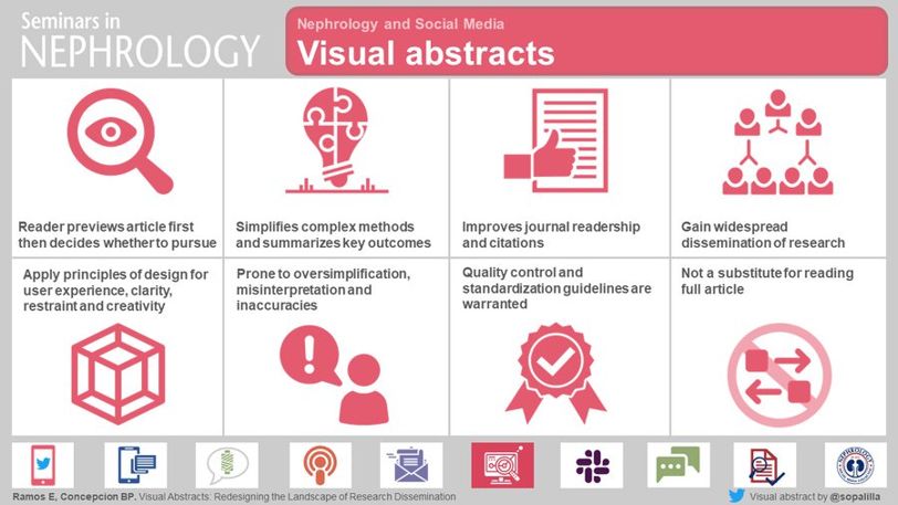
A visual abstract, sometimes called a graphical abstract or an infographic, is a simplified pictorial representation of a study, concept, or idea. A visual abstract gives viewers a gist of the study. It serves as a review, an advertisement, and a learning aid- equal parts trailer, billboard, and instruction manual.
A visual abstract is designed to capture the essence of the article in a single glance – to process key methods, findings, and conclusions rapidly. It is important to remember that a visual abstract is not a substitute for reading the paper itself.
History of the visual abstract
Dr. Andrew Ibrahim is credited with introducing the visual abstract in medicine when he incorporated visual abstracts into articles for the Annals of Surgery in 2017. Shortly thereafter, the American Journal of Kidney Diseases blog incorporated visual abstracts into NephMadness in March of 2017 with a huge success. It is now commonplace to see nephrology journals use visual abstracts.
According to research compiled by 3M (Post-It note)—visual data are processed 60,000 times faster than text and the incorporation of visual aids have been shown to improve learning by 400%. Similarly, digital marketers have found that web pages with videos and images enjoy twice the views of text-only pages. As children, we preferred books with more pictures, right?!
The visual abstract capitalizes on our inherent affinity toward visuals and our ability to rapidly process and retain visual information.

Do visual abstracts work?
The goal of the visual abstract is to aid readers to quickly and effortlessly understand the details of the research. A few studies have looked into the effect of visual abstracts. Ibrahim et al showed that, relative to tweets without a visual abstract, tweets with a visual abstract had a 7.7-fold increase in Twitter impressions, an 8.4-fold increase in retweets, and resulted in a 2.7-fold increase in article visits. Published anecdotes by Lindquist et al and Koo et al suggest more visibility on social media as well.
Does this translate to citations? That much is not clear. One study showed that manuscripts without VA had more PDF downloads, abstract views, and total citations than manuscripts with VA in one journal! As always, the quality of the study and the paper is what matters and VA is a tool to increase the visibility and distribution.
So, how is a visual abstract made?
Since learning how to make visual abstracts for the NSMC internship, I’ve been asked by many friends, colleagues and former teachers about resources to make one.
Steps in making a visual abstract: (Check out my tweetorial on how to make a visual abstract here)
There are 4 steps in creating a visual abstract/ infographic:
- Concept:
- Content: It is very important that you know the study you are making a visual abstract for. This is the heart (or kidney, if you may!) of the whole project and essential to avoid misrepresentation of the data
- Type of study: Randomized clinical trial (RCT), meta analysis, retrospective, case-control, observational, review article
- Cohort: number, characteristics, inclusion /exclusion criteria
- Intervention: describe normal first (eg placebo followed by the drug). Before giving the result it is important to convey the normal and then give the result of the intervention.
- Outcomes (primary and important secondary outcomes). It is imperative that the primary outcome is highlighted.
- Know your audience (journals) or in case of infographic (educational, or patients), and use a reader-friendly language
- Review the guidelines of the journal or site for which you are creating the visual abstract, like font type and size, line-widths, colors, and the dimension of the visual abstract. Make sure to review any previously published visual abstracts and articles to get a grasp of how the study is represented in a pictorial format.
- Content: It is very important that you know the study you are making a visual abstract for. This is the heart (or kidney, if you may!) of the whole project and essential to avoid misrepresentation of the data
- Design:
- Program: Microsoft Powerpoint , Keynote), or Inkscape
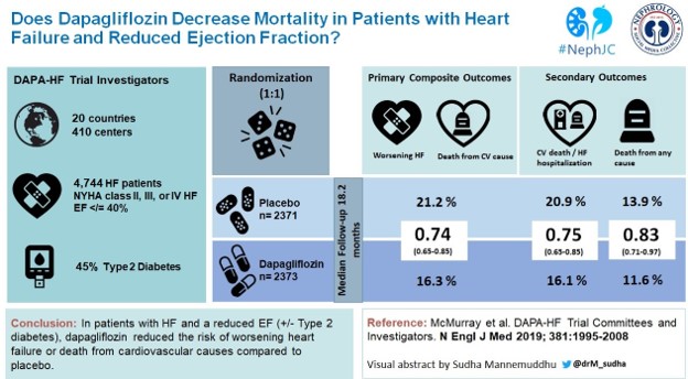
- Divide slide into sections: title, methods/cohort, results, conclusions
- Choose the slide color scheme and add colored panels. Try a color-scheme generator such as Coolors if you get stuck.
- Images/ icon: Select the most appropriate images and visual components that accurately describe the subject that you want to convey. Icons are available for free and/ or purchase (biorender, icon finder, the noun project, mind the graph). Remember you’re aiming for representation of the idea, not necessarily an actual illustration. So “water” can just be a single droplet icon for example.
- Add the pertinent data
- Check for alignment and justification
- Citation of the article
- Include your name and Twitter handle, usually in the bottom right hand corner
3. Review and refine:
Many journals have their own primers (CJASN, KI and KIReports) and will have slight variations to maintain uniformity.
Visual abstracts should be reviewed by people with experience in creating them. Also, having a few who are oblivious to the study assess your visual abstract tests its clarity and simplicity.
4. Save as a high resolution image
Preferably in a PNG format.
Common mistakes in making a visual abstract:
- Being too vague: simplicity should not compromise quality
- Using images excessively: Every image should convey a message. Before adding an image or icon, question yourself “ will adding this aid in a better understanding of the study?” Add only if the answer is “yes”
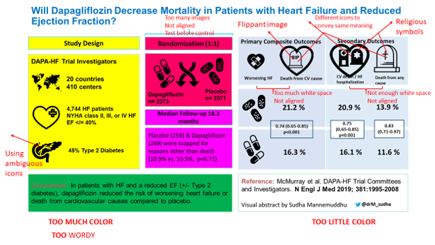
- Avoid flippant images (Eg: as shown in the figure)
- Too much or not enough color: Use pleasing colors with appropriate contrast.
- Too much text: Adding too much text will not only make visual abstract look busy but also wastes the effort in creating one.
- Not enough blank space: sizing your icons and images with appropriate, preferably equal space between them is important. If there is not enough space between them, it can look like stickers thrown together for a scrapbook.
- Avoid a specific skin tone for human subjects, ambiguous/ controversial icons/images, and religious symbols
Pitfalls of the Visual Abstract
- Can be prone to oversimplification
- Results misinterpretation is a possibility as it does not include specific details of a study. It is crucial to remember that a visual abstract is not a substitute for critical analysis of a study.
- Quality control in terms of accuracy, aesthetics, and simplicity remains a challenge
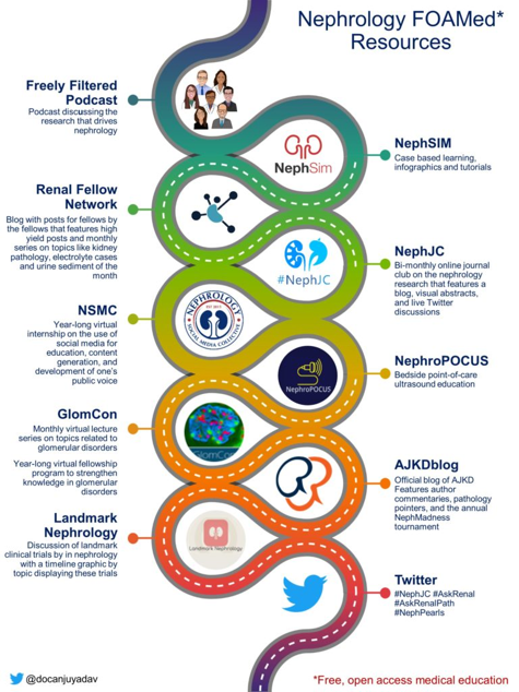
Other uses for Visual Abstracts or Infographics
- In blog posts (eg., The Skeleton Key Group, Renal Fellow Network)
- As a teaching tool, quick and effective. (Nephmadness, Neph_Sim, NephJC)
- In scientific conferences and public lectures (posters, and visual abstract created based on speaker’s presentation)
- Grant applications
- Social media
- Webpages (personal/ departmental/ lab)
- Media releases
Future of the visual abstract
- Many journals are adopting visual abstracts ,which calls for a quality control team for visual abstract in the editorial board (Eg: CJASN VA editorial board). This oversight by journals allows for authors and the editorial team to review what is being presented, hopefully minimizing inaccuracies, bias, and misrepresentation of the data.
- Efforts at training individuals in creating visual abstracts and providing a venue for feedback should be encouraged (Eg The Nephrology Social Media Collective Internship – @NSMCInternship). This internship trains individuals to create nephrology content for various social media platforms: websites, blogs, podcasts, visual abstracts, journal clubs, games, and newsletters.
- A repository or dedicated websites to organize and collect visual abstracts would be ideal in view of increased generation of visual abstracts (Eg. Having visual abstracts available through a link when an article is searched through PubMed or a similar interface)
Need more information? Read this excellent article by Beatrice P. Concepcion @KidneyBea_n and Everly Ramos.
S. Sudha Mannemuddhu, MD drM_sudha
Assistant Professor and Pediatric Nephrologist
East Tennessee Children’s Hospital, University of Tennessee, Knoxville, TN

